From the Rockaways to Los Angeles, designers are crafting interiors where creativity runs wild
Emerging from the challenges of quarantine life, many of us are leaning into our indulgent sides. This proclivity for pleasure can manifest in a variety of forms—think Netflix’s steamy hit series “Sex/Life” and the secret tunnel in Cara Delevingne’s exuberant Los Angeles pad.
In this spirit, some designers are crafting one-off spaces where their creativity can run wild. Unbound by the rules and constraints of the rest of the house, these spaces—often small—can have a big impact. In some cases, the juxtaposition of an aesthetically indulgent space and the rest of the home’s decor brings out the best in both.
AD PRO turned to some of the minds behind the trend to see how they walk the tightrope of statement-making design.
Portal Possibilities
Charu Gandhi, designer of the London studio Elicyon, intended to “create a room that was ‘other’ than the rest of the home, an experience for a visitor.” Early on, Gandhi says, the studio turned to the idea of a flora-and-fauna-centered theme, adding that the color pink “was an early inspiration.”
The home’s decor is serene, primarily cast in an ivory palette. But Gandhi explains that once you open the blond timber door to the guest room, “Boom! You’re in the jungle room. That is part of its pleasure. It does not hold back any punches and its impact is immediate and forceful.”
All the furniture was curated specifically for the project. Gandhi muses, “In fact, the iterative and playful process of pulling the furniture together is really where the magic came together.”
Purvi Padia believes that “residential luxury and style are not concrete ideas but rather creative works of art.” After a decade in the beauty and fashion industries, Padia got artistic when she turned to her own home.
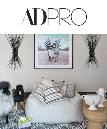
When designing her Tribeca pad, Padia wanted a room for her children that was more playful and casual than the rest of the home. She explains that it was important that the room feel “youthful and whimsical, but since it lives literally in the middle of the floor plan on the lower level of the duplex, it acts as a passageway as well. So, I needed it to serve as a kids’ lounge yet also be chic enough to be a focal point of the home.”
The rest of the unit’s polished decor transitions in this connecting room’s contrasting play on light and dark. The room also boasts an African safari motif. “While we used contrast to create pop and interest, we kept the overall color palette neutral and incorporated a lot of texture, so as you transition through the home to the rest of the spaces, there is the common thread of neutral tones and rich textures,” Padia adds.

